Customize Radio Button Appearance with CSS
If you’ve ever needed to allow a user to select one from a range of options on a webpage, you’ll know that the radio input type lets you do this.

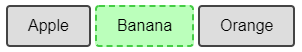
But what if you want to customize the appearance and instead of showing regular radio buttons you want clickable buttons like this?

Well, thanks to a very helpful StackOverflow answer I was able to work out how to create this style of radio buttons.
First of all, you start off by hiding the actual circular radio buttons themselves – we’ll just be styling the labels. We can select them by using input[type="radio"]. Initially I was hiding this by setting display:none, but as Patryk Kiedrowski points out in the comments, that will mean they are unfocusable and unable to be navigated via the keyboard. So instead, we make it invisible with the following settings:
.radio-toolbar input[type="radio"] {
  opacity: 0;
  position: fixed;
  width: 0;
}
Next, we set the labels up to look how we want them by default when unselected:
.radio-toolbar label {
    display: inline-block;
    background-color: #ddd;
    padding: 10px 20px;
    font-family: sans-serif, Arial;
    font-size: 16px;
    border: 2px solid #444;
    border-radius: 4px;
}
Now we have to style the selected one differently. This is where the real CSS magic happens – we need to use the :checked selector and the “adjacent sibling” selector (+ sign). So this CSS rule applies to any label that immediately follows a checked radio button.
.radio-toolbar input[type="radio"]:checked + label {
    background-color:#bfb;
    border-color: #4c4;
}
For accessibility reasons, we'd also like to change the appearance when a button has focus. We can use the same selector technique. In this example I'm simply making the border dashed.
.radio-toolbar input[type="radio"]:focus + label {
    border: 2px dashed #444;
}
Here's what it looks like focused. This allows you to use left and right arrows to change selection:
Finally, I wanted a hover effect so that as you hovered the mouse over the other options they changed appearance. This can be achieved with the :hover selector.
.radio-toolbar label:hover {
  background-color: #dfd;
}
Here’s a complete example:
Comments
Hey - really appreciate this writeup, I was in a search-hole until I stumbled upon it, and it made my day.
GuthrieThanks!
I was about to make a custom control, then thought perhaps a radio button group would do this if can style it apprpriately, this is just the ticket!
Mickey PuriActually so fucking thank you, i was searching for someone that styled his radios like this and found you, bless you my friend.
Natsu ShiyoActually, you should not hide the inputs by using display: none nor visibility: hidden, as it makes them unfocusable and disables the ability to use them with keyboard. What you should do is hide them by setting width and height to 0px and setting opacity to 0.
Patryk Kiedrowskithanks for the tip - I've updated the post.
Mark HeathSame with me! Exactly what I needed.
Tj ChambersThank you so much for this. It has helped greatly. Any idea how to if say the two choices are Approve and Deny have them defaulted to gray when initially loaded or have no value but when selected either be green for Approve and Red for Deny?
Robert MuzzyThanks again
yes, just give each choice its own id, and then have a different CSS rule for the checked color of each one
Mark HeathThank you
Robert MuzzyExactly what I was looking for, thank you!
Janet NeckelReally liked this, but the input element isn't firing a change event.
Dennis NolanI had to add a click event to the label.
Also the checked attribute on the input[type="radio"] is not being either set or reset.
Therefore add the following click event listener to the radio-toolbar elements.
function radio_toolbar_click (ev){
let checked = document.querySelector('input[name="radioFruit"]:checked');
if(checked) {
checked.checked = false;
}
ev.target.previousElementSibling.checked = true;
}
Awesome. It helped me very much. Thank you
HarrisGhmmmm...this is nice, but how would I go about doing the same thing if the input was not a sibling but a child of the label...this is how react recommends creating the html for radio buttons, but i would like to style it the same way that you have...
Richard Nashtry using an 'input' event
Agatathis is awesome, many thanks
Santiago SanchezI'm quite late here, but since no one responded earlier...
paisleyCSS can't select an ancestor (the label) from a descendant (the input), but a JavaScript EventListener could. (In this case, I think you'd want the "change" event):
const toolbar = document.querySelector('.radio-toolbar');
toolbar.addEventListener('change', handleFruitChanges);
function handleFruitChanges(event){
const changedThing = event.target;
if(changedThing.name == 'radioFruit'){
changedThing.parentElement.classList.toggle('checked-style');
}
}
...This assumes your CSS does something special to elements that have the `checked-style` class.
That said, not everyone agrees that nesting inputs inside labels is a best practice, so if someone felt like going cowboy and ignoring the React style guide on this, I probably wouldn't tattle on them.
Very helpful, thank you! I think this writeup is worthy of its own answer on the linked Stack Overflow question. Happy to vote up if you submit it.
Dave PowersHello, I am creating these radio buttons dynamically so I cant use the label. Is there any other way I can add the value inside the button? Thanks in Advance
Samanyu Mehrai tried many ways to get the value of checked one using jquery, none of them functional. please help me how to get the value of checked radio using jquery. thanks
KelumThx! You've helped me a lot!
Marcus BondezanGreat, thank you. Works like a charm.
Stefan CoetzeeEverything works until I get to the :checked part. The background doesn't change at all but the buttons are still being selected.
Allison Barnettnabbed.
yerfackingmammymake sure your input's "id" attribute matches your label's "for" attribute
kydkitCould you please tell me more? It doesn't work for me neither. I know that the button is checked, but can't see it.
Artur Baczewski