Bootstrap Themed Radio Button Groups with Knockout
I recently wanted to make use of the Bootstrap button groups to style some radio buttons. This is quite easy to do in Bootstrap:
<div class="btn-group" data-toggle="buttons">
  <label class="btn btn-primary active">
    <input type="radio" name="options" id="option1" autocomplete="off" checked> Radio 1 (preselected)
  </label>
  <label class="btn btn-primary">
    <input type="radio" name="options" id="option2" autocomplete="off"> Radio 2
  </label>
  <label class="btn btn-primary">
    <input type="radio" name="options" id="option3" autocomplete="off"> Radio 3
  </label>
</div>
And gives the following appearance
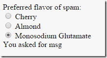
But I wanted to use knockout.js to bind to the radio buttons. In theory this is easy to do, by using the checked binding. Here’s a very simple example based on the knockout documentation:
Preferred flavor of spam:
<div><input type="radio" name="flavorGroup" value="cherry" data-bind="checked: spamFlavor" /> Cherry</div>
<div><input type="radio" name="flavorGroup" value="almond" data-bind="checked: spamFlavor" /> Almond</div>
<div><input type="radio" name="flavorGroup" value="msg" data-bind="checked: spamFlavor" /> Monosodium Glutamate</div>
You asked for <span data-bind="text: spamFlavor"></span>

<script>
var viewModel = {
    spamFlavor: ko.observable("almond") // Initially selects only the Almond radio button
};

ko.applyBindings(viewModel);
</script>
And this works nicely:
But what happens when we try to style these radio buttons with Bootstrap?
<div class="btn-group" data-toggle="buttons">
    <label class="btn btn-default"><input type="radio" name="flavorGroup" value="cherry" data-bind="checked: spamFlavor" /> Cherry</label>
    <label class="btn btn-default"><input type="radio" name="flavorGroup" value="almond" data-bind="checked: spamFlavor" /> Almond</label>
    <label class="btn btn-default"><input type="radio" name="flavorGroup" value="msg" data-bind="checked: spamFlavor" /> Monosodium Glutamate</label>
</div>
Well we get the look we want:
But the default selected option (Almond) is not initially highlighted, and worse, as we select different options, our knockout model is no longer updated with the selection. Basically, what’s happening is the bootstrap data-toggle directive is fighting with the knockout data-bind checked binding. If we remove data-toggle, the behaviour is back but the appearance is now wrong. We see the radio buttons, and the selected option button is no longer highlighted with a different background colour.
How can we fix this? Well, we can hide the toggle buttons with a bit of CSS:
input[type="radio"] {
  display: none;
}
But now we have no visual way of knowing which option is selected. In bootstrap, we need to apply the active class to the button that is selected. We can do that with the knockout CSS binding:
<div class="btn-group" >
    <label class="btn btn-default" data-bind="css: { active: spamFlavor()=='cherry'}"><input type="radio" name="flavorGroup" value="cherry" data-bind="checked: spamFlavor" /> Cherry</label>
    <label class="btn btn-default" data-bind="css: { active: spamFlavor()=='almond'}"><input type="radio" name="flavorGroup" value="almond" data-bind="checked: spamFlavor" /> Almond</label>
    <label class="btn btn-default" data-bind="css: { active: spamFlavor()=='msg'}"><input type="radio" name="flavorGroup" value="msg" data-bind="checked: spamFlavor" /> Monosodium Glutamate</label>
</div>
And finally we have the look and behaviour we want:
The CSS binding syntax repeating the value for each option is a bit clunky though, so probably the best thing would be to add a helper method on the view model, or even make a custom binding extension to simplify this. So there’s still some improvements to be made. But hopefully this will help anyone who runs into the same issue I did. And if you know of an easier way of solving this problem, please let me know in the comments.
 A place for me to share what I'm learning: Azure, .NET, Docker, audio, microservices, and more...


Comments
Nice article!
Johnson