Simpler CSS Blog Layouts with Flexbox
Almost 10 years ago, I blogged about how to use CSS to create a simple blog layout with a header, footer, main section and sidebar(s). I wrote it mainly for my own reference, because it seemed far harder to achieve than it ought to be, and the solution I came up with relied on some ugly hacks including hard-coded widths and margins, and a special “clear” div to force the footer to stay underneath both the sidebar and the main content area.
Of course these days there’s always Bootstrap to help us out, but it does feel rather heavyweight to depend on such a large framework just to achieve what ought to be a very simple layout.
But recently I’ve taken another look at Flexbox. Flexbox is extremely powerful although perhaps a little intimidating at first. And now that the majority of active browsers support it, it’s worth considering as it offers a much simpler way to get the layout we want.
At first glance, Flexbox appears to be about arranging elements in a single line, either horizontally or vertically, so it might feel like it wouldn’t be appropriate for a typical blog layout, which is more grid or table-like with its three rows and two or three columns.
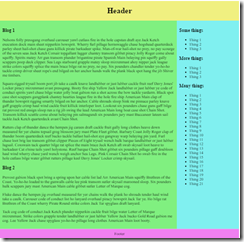
But in this post I’ll show you how we can use Flexbox to create a typical blog layout with sidebar to the right of a main article area, and a header and footer to get something looking like this:
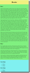
And our layout will have the capability to adjust its layout for smaller screens such as phones, putting the sidebar underneath the main blog area where necessary:
So first of all, the HTML is about as straightforward as it gets. We’ll create one div for each of the four sections (header, main area, sidebar and footer), and put them all in a container div. No need for any clearfix hacks here.
<div class="container">
  <div class="header">
    <h1>Header</h1>
  </div>
  <div class="blog">
    <h3>Blog 1</h3>
    ...
  </div>
  <div class="sidebar">
    <h3>Some things</h3>
    ...
  </div>
  <div class="footer">Footer</div>
</div>
So how do we set up the actual Flexbox part of this? Well, the container div needs to be set up as display: flex, and the flex-flow needs to be set as row wrap. So we’re saying, lay out the header, blog, sidebar, and footer in a horizontal row, but wrap if we need to.
.container {
    display: flex;
    flex-flow: row wrap;
}
And we will need to wrap, because we’re going to say that each of the sections has a flex-grow value of 1 and a flex-basis of 100%. The 1 means all sections should have equal width (initially at least), but the flex-basis means they all want to take up 100% of available width. So what ends up happening is that each of the four sections wrap and end up sitting on top of each other vertically. This is our mobile friendly layout.
.header, .blog, .sidebar, .footer {
    flex-grow: 1;
    flex-basis: 100%;
}
Now so far we seem to have gone to an awful lot of trouble just to stack each section on top of each other, which we could have achieved without Flexbox.
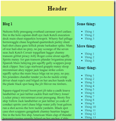
But the power of Flexbox comes into its own when we want to adjust the layout for wider screens. If the screen is greater than 600 pixels wide, we’ll give the blog section a flex-grow of 2 and a flex-basis of 0px, and the sidebar will have a flex-grow of 1 and a flex-basis of 0px; This means these sections no longer are asking for 100% of the available width, so they will be laid out side by side, and the flex-grow values mean that the blog section will be twice as wide as the sidebar. So the sidebar gets 1/3 of the available space.
Here’s the CSS for that:
@media all and (min-width: 600px) {
  /* if screen > 600px sidebar appears alongside blog getting 1/3rd of space */
  .blog { flex: 2 0px; }
  .sidebar { flex: 1 0px; }
}
And so as we go beyond 600 pixels wide, the sidebar suddenly snaps to the right:
We can change things further on wider screens and give the sidebar just 1/4 of the available space if we want:
@media all and (min-width: 800px) {
  /* On bigger screens, sidebar now only gets 1/4 of space */
  .blog { flex: 3 0px; }
  .sidebar { flex: 1 0px; }
}
In summary, you can see that the CSS required for this layout is much simpler with Flexbox than the previous floats, margins and clears technique I discussed. It also lends itself much better to being responsive to screen size. For the first time in a long time I feel like I can easily layout a webpage how I want it, without having to use Bootstrap or read complicated explanations of floats and clearfixes.
I’ve put the full example HTML and CSS for this example in a GitHub Gist. Hope this proves useful to someone, and do let me know in the comments if there’s an even easier way to achieve this layout.
 A place for me to share what I'm learning: Azure, .NET, Docker, audio, microservices, and more...


Comments
Nice tutorial. Loved it!
Menezy👑