Styling a ListBox in Silverlight (Part 1)
This post describes how to style a ListBox in Silverlight 2 beta 1. For an updated version for beta 2, please look here.
One of the challenges of styling a control like the ListBox in Silverlight is the sheer number of subcomponents it uses. A ListBox has its own template which includes a ScrollViewer and an ItemPresenter. The ScrollViewer contains Scrollbars which contain RepeatButtons, Thumbs etc.
My original idea was to make copies of the default styles and slowly change them to look how I wanted, but I soon realised that the sheer quantity of XAML would get very confusing. So I decided to take the opposite approach. Start with a very basic template and slowly add features until it looks right. So here is the most basic of all ListBox templates:
<UserControl.Resources>
  <ControlTemplate x:Key="ListBoxTemplate1">
      <Grid x:Name="LayoutRoot">
          <ItemsPresenter />
      </Grid>
  </ControlTemplate>
</UserControl.Resources>
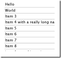
This simply presents the items, with no outline of any sort displayed. To test our template, let's add some items to a ListBox:
<ListBox HorizontalAlignment="Stretch"
         Margin="160,81,318,238"
         VerticalAlignment="Stretch"
         Template="{StaticResource ListBoxTemplate1}">
      <ListBoxItem>Hello</ListBoxItem>
      <ListBoxItem>World</ListBoxItem>
      <ListBoxItem>Item 3</ListBoxItem>
      <ListBoxItem>Item 4 with a really long name</ListBoxItem>
      <ListBoxItem>Item 5</ListBoxItem>
      <ListBoxItem>Item 6</ListBoxItem>
      <ListBoxItem>Item 7</ListBoxItem>
      <ListBoxItem>Item 8</ListBoxItem>
      <ListBoxItem>Item 9 out of bounds</ListBoxItem>
      <ListBoxItem>Item 10 out of bounds</ListBoxItem>
</ListBox>
This is what it looks like so far:
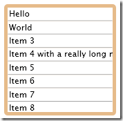
Next step is the border for our listbox. I want all the listbox items to be drawn on top of a filled rounded rectangle. To do this, I have added a Border control. I have given it some padding so we can actually see it, because the ListBoxItem template is currently drawing white rectangles over the top of it.
<Grid x:Name="LayoutRoot">
  <Border Padding="5" Background="#E6BB8A" CornerRadius="5">
      <ItemsPresenter />
  </Border>
</Grid>
This is what it looks like now:
So before we go doing anything further to the ListBox template itself (like adding scrollbars), let's sort out the item templates.
For this we need to create a new style - ListBoxItemStyle1. (n.b. I should really have created a style with a template in rather than just a template for the ListBox itself - see further down in this post.)
So here is a minimal ListBoxItem style:
<Style x:Key="ListBoxItemStyle1" TargetType="ListBoxItem">
  <Setter Property="Foreground" Value="#FF000000" />
  <Setter Property="Template">
      <Setter.Value>
          <ControlTemplate TargetType="ListBoxItem">
              <Grid x:Name="RootElement">
                  <ContentPresenter
                      Content="{TemplateBinding Content}"
                      Foreground="{TemplateBinding Foreground}"
                   />
              </Grid>
          </ControlTemplate>
      </Setter.Value>
  </Setter>
</Style>
As you can see, it is a little more involved than the basic ListBox template. We needed to have the Foreground property set to a sensible default value (Black) for anything to appear. And we have simply used one ContentPresenter control to show the contents of each ListBox item.
We can tell our ListBox to use it by setting its ItemContainerStyle as follows:
<ListBox
  HorizontalAlignment="Stretch"
  Margin="160,81,318,238"
  VerticalAlignment="Stretch"
  Template="{StaticResource ListBoxTemplate1}"
  ItemContainerStyle="{StaticResource ListBoxItemStyle1}"
  >
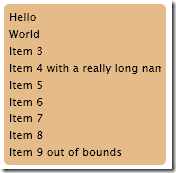
Now we have got rid of those white backgrounds:
For the final step for this post, I will switch from using a Template to a style for the main ListBox control. This allows me to specify which ItemContainerStyle I want it to use. The only caveat is that ListBoxItemStyle1 must be defined before ListBoxStyle1 or Silverlight will throw one of its characteristically unhelpful errors.
<Style x:Key="ListBoxStyle1" TargetType="ListBox">
  <Setter Property="ItemContainerStyle" Value="{StaticResource ListBoxItemStyle1}" />
  <Setter Property="Template">
      <Setter.Value>
          <ControlTemplate TargetType="ListBox">
              <Grid x:Name="LayoutRoot">
                  <Border Padding="5" Background="#E6BB8A" CornerRadius="5">
                      <ItemsPresenter />
                  </Border>
              </Grid>
          </ControlTemplate>
      </Setter.Value>
  </Setter>
</Style>
This allows the style to be specified much more simply:
<ListBox
  HorizontalAlignment="Stretch"
  Margin="160,81,318,238"
  VerticalAlignment="Stretch"
    Style="{StaticResource ListBoxStyle1}"
  >
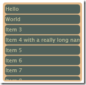
Finally then we will make the item template just a little more interesting. I've added a border to the item presenter, and modified some margins and colours:
<Border CornerRadius="5" Background="#51615B" Margin="1">
<ContentPresenter
  Margin="1"
  Content="{TemplateBinding Content}"
  Foreground="{TemplateBinding Foreground}"
/>
</Border>
This leaves us with something looking like this:
So that is at least a reasonable start. Our ListBox is missing at least three crucial features though, which I hope to tackle in a future blog-post:
- Scrollbars
- Selected Item Rendering
- Mouse Over Rendering
 A place for me to share what I'm learning: Azure, .NET, Docker, audio, microservices, and more...


Comments
This is an awesome series! I have not seen anything else like this. Thank you for your work
Richard BinningtonRichard
Thank you for this wonderful step by step series! It really helped met out!
KarineKarine