Styling a ListBox in Silverlight (Part 2 - Scrollbars)
This post describes how to style a ListBox in Silverlight 2 beta 1. For an updated version for beta 2, please look here.
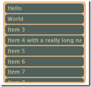
In my first post, I explained how to create a very basic ListBox and ListBoxItem style that governed the appearance of a ListBox. It is still very rudimentary though, and doesn't give any visual feedback of selected items or mouse over. It also doesn't have any scrollbars.
Adding scrollbars is actually quite simple. All we need to do is add a ScrollViewer to our ListBox style.
<Border Padding="3" Background="#E6BB8A" CornerRadius="5">
    <ScrollViewer x:Name="ScrollViewerElement"
        Padding="{TemplateBinding Padding}">
        <ItemsPresenter />
    </ScrollViewer>
</Border>
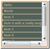
Which gives us scrollbars:
Unfortunately, as nice as the default scrollbars look, they do not fit at all with the visual theme of our ListBox. We need another style which we will base on the default ScrollViewer style.
Unfortunately, Expression Blend seems to have a problem rendering anything using the default ScrollViewer style, so at this point I was slowed down by having to build and run my application to see the effects of any changes.
I started off by removing the one pixel border width around the whole scrollbar. Also, I hid the little grey square in the corner.
Here's the ScrollViewer template. It looks a little intimidating because I left in most of the stuff from the default ScrollViewer style. We could have got rid of a lot of it, but as we are not planning to customise this part very much, we will leave it in there.
<Style TargetType="ScrollViewer" x:Key="ScrollViewerStyle1">
    <Setter Property="Template">
        <Setter.Value>
            <ControlTemplate TargetType="ScrollViewer">
                <Border>
                    <Grid Background="{TemplateBinding Background}">
                        <Grid.ColumnDefinitions>
                            <ColumnDefinition Width="*"/>
                            <ColumnDefinition Width="Auto"/>
                        </Grid.ColumnDefinitions>
                        <Grid.RowDefinitions>
                            <RowDefinition Height="*"/>
                            <RowDefinition Height="Auto"/>
                        </Grid.RowDefinitions>
                        <ScrollContentPresenter
                          x:Name="ScrollContentPresenterElement"
                          Grid.Column="0"
                          Grid.Row="0"
                          Content="{TemplateBinding Content}"
                          ContentTemplate="{TemplateBinding ContentTemplate}"
                          Cursor="{TemplateBinding Cursor}"
                          Background="{TemplateBinding Background}"
                          FontFamily="{TemplateBinding FontFamily}"
                          FontSize="{TemplateBinding FontSize}"
                          FontStretch="{TemplateBinding FontStretch}"
                          FontStyle="{TemplateBinding FontStyle}"
                          FontWeight="{TemplateBinding FontWeight}"
                          Foreground="{TemplateBinding Foreground}"
                          HorizontalContentAlignment="{TemplateBinding HorizontalContentAlignment}"
                          TextAlignment="{TemplateBinding TextAlignment}"
                          TextDecorations="{TemplateBinding TextDecorations}"
                          TextWrapping="{TemplateBinding TextWrapping}"
                          VerticalContentAlignment="{TemplateBinding VerticalContentAlignment}"
                          Margin="{TemplateBinding Padding}" />
                        <ScrollBar
                          x:Name="VerticalScrollBarElement"
                          Grid.Column="1"
                          Grid.Row="0"
                          Orientation="Vertical"
                          Cursor="Arrow"
                          Visibility="{TemplateBinding ComputedVerticalScrollBarVisibility}"
                          ViewportSize="{TemplateBinding ViewportHeight}"
                          Minimum="0"
                          Maximum="{TemplateBinding ScrollableHeight}"
                          Value="{TemplateBinding VerticalOffset}"
                          Width="18"/>
                        <ScrollBar
                          x:Name="HorizontalScrollBarElement"
                          Grid.Column="0"
                          Grid.Row="1"
                          Orientation="Horizontal"
                          Cursor="Arrow"
                          Visibility="{TemplateBinding ComputedHorizontalScrollBarVisibility}"
                          ViewportSize="{TemplateBinding ViewportWidth}"
                          Minimum="0"
                          Maximum="{TemplateBinding ScrollableWidth}"
                          Value="{TemplateBinding HorizontalOffset}"
                          Height="18"/>
                    </Grid>
                </Border>
            </ControlTemplate>
        </Setter.Value>
    </Setter>
</Style>
So now we need to tell our ScrollViewer to use this style.
<ScrollViewer x:Name="ScrollViewerElement"
    Style="{StaticResource ScrollViewerStyle1}"
    Padding="{TemplateBinding Padding}">
    <ItemsPresenter />
</ScrollViewer>
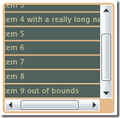
And this is what it looks like:
Kind of disappointing, huh? That's because we haven't styled the scrollbars themselves yet. Now we need to take a look at the default scrollbar style. Now these really are intimidating. They contain hundreds of lines of XAML with plenty of Storyboards and gradients. Even more confusingly they contain templates within templates.
We will progress by looking at each of these sub-templates one by one. First up is HorizontalIncrementTemplate, which is the right-arrow at the end of the horizontal scrollbar. Here's the default implementation:
<ControlTemplate x:Key="HorizontalIncrementTemplate">
    <Grid x:Name="RootElement" Background="#00000000">
        <Grid.Resources>
            <Storyboard x:Key="Normal State" />
            <Storyboard x:Key="MouseOver State">
                <ColorAnimation Duration="0:0:0.2"
                 Storyboard.TargetName="ButtonColor"
                 Storyboard.TargetProperty="Color" To="#FF557E9A" />
            </Storyboard>
            <Storyboard x:Key="Disabled State">
                <DoubleAnimation Duration="0:0:0"
                 Storyboard.TargetName="ButtonVisual"
                 Storyboard.TargetProperty="Opacity" To=".6" />
            </Storyboard>
        </Grid.Resources>
        <Grid.ColumnDefinitions>
            <ColumnDefinition Width="35*"/>
            <ColumnDefinition Width="30*"/>
            <ColumnDefinition Width="35*"/>
        </Grid.ColumnDefinitions>
        <Grid.RowDefinitions>
            <RowDefinition Height="25*"/>
            <RowDefinition Height="50*"/>
            <RowDefinition Height="25*"/>
        </Grid.RowDefinitions>
        <Path x:Name="ButtonVisual"
         Grid.Column="1" Grid.Row="1" Stretch="Fill"
         Data="F1 M 511.047,352.682L 511.047,342.252L 517.145,347.467L 511.047,352.682 Z ">
            <Path.Fill>
                <SolidColorBrush x:Name="ButtonColor" Color="#FF313131" />
            </Path.Fill>
        </Path>
        <Rectangle x:Name="FocusVisualElement"
         Grid.ColumnSpan="3" Grid.RowSpan="3"
         Stroke="#666666" Fill="#00000000"
         StrokeDashArray=".2 5"
         StrokeDashCap="Round"
         IsHitTestVisible="false"
         Opacity="0" />
    </Grid>
</ControlTemplate>
Although this looks like a lot of code, all that is happening is simply a triangle is being drawn. The grid simply serves to give an appropriate margin around the triangle. The animations change the colour for mouse-over and mouse-down. There is also a focus rectangle. The actual background to the arrow is drawn by another part of the template. So for now I will leave these as they are and to move onto the "Thumb" components.
I have simplified the thumb component to be a rounded rectangle that changes colour as you hover over it. I also played with the margins to make it a little thinner.
<ControlTemplate x:Key="VerticalThumbTemplate">
    <Grid x:Name="RootElement">
        <Grid.Resources>
            <!--Colors-->
            <Color x:Key="ThumbForegroundColor">#ACAC39</Color>
            <Color x:Key="ThumbHoverColor">#73AC39</Color>
            <!--Storyboards-->
            <Storyboard x:Key="Normal State" />
            <Storyboard x:Key="MouseOver State">
                <ColorAnimation Duration="0:0:0.1"
                                Storyboard.TargetName="ThumbForeground"
                                Storyboard.TargetProperty="Color"
                                To="{StaticResource ThumbHoverColor}" />
            </Storyboard>
            <Storyboard x:Key="Disabled State">
                <DoubleAnimation Duration="0:0:0"
                                 Storyboard.TargetName="ThumbForeground"
                                 Storyboard.TargetProperty="Opacity"
                                 To="0" />
            </Storyboard>
        </Grid.Resources>
        <Grid x:Name="ThumbVisual">
            <Rectangle x:Name="Background"
                       Margin="4.5,.5,4.5,.5"
                       RadiusX="5" RadiusY="5" >
                <Rectangle.Fill>
                    <SolidColorBrush x:Name="ThumbForeground"
                       Color="{StaticResource ThumbForegroundColor}" />
                </Rectangle.Fill>
            </Rectangle>
        </Grid>
    </Grid>
</ControlTemplate>
With a similar change to the HorizontalThumbTemplate, our scrollbars are now finally beginning to change in appearance (n.b. To see the changes we have also had to modify our ScrollViewer style so that the two scrollbars it creates use the new ScrollBar style).
Finally we are ready to update the remaining parts of the ScrollBar template - HorizontalRootElement and VerticalRootElement. Both are made up of a grid containing four repeat buttons and a thumb. Two of the repeat buttons are for the increment icons, while the other two are the invisible parts either side of the thumb that you can click for a large change.
Again, the change is simply to get rid of a load of unnecessary stuff. In our case we are simply putting a thin rounded rectangle behind the thumb and invisible repeat buttons, with no background behind the small increment buttons. Here's the new HorizontalRootElement template:
<!-- Horizontal Template -->
<Grid x:Name="HorizontalRootElement">
    <Grid.ColumnDefinitions>
        <ColumnDefinition Width="Auto" />
        <ColumnDefinition Width="Auto" />
        <ColumnDefinition Width="Auto" />
        <ColumnDefinition Width="*" />
        <ColumnDefinition Width="Auto" />
    </Grid.ColumnDefinitions>

    <Grid.RowDefinitions>
        <RowDefinition />
        <RowDefinition />
    </Grid.RowDefinitions>

    <!-- Track Layer -->
    <Rectangle Margin="0,6,0,6" Grid.RowSpan="2" Grid.Column="1"
        Grid.ColumnSpan="3" Fill="#FF404040" RadiusX="3" RadiusY="3" />

    <!-- Repeat Buttons + Thumb -->
    <RepeatButton x:Name="HorizontalSmallDecreaseElement" Grid.Column="0"
       Grid.RowSpan="2" Width="16" IsTabStop="False" Interval="50"
       Template="{StaticResource HorizontalDecrementTemplate}" />
    <RepeatButton x:Name="HorizontalLargeDecreaseElement" Grid.Column="1"
       Grid.RowSpan="2" Width="0"
       Template="{StaticResource RepeatButtonTemplate}"
       Interval="50" IsTabStop="False" />
    <Thumb x:Name="HorizontalThumbElement" MinWidth="10" Width="20"
       Grid.Column="2" Grid.RowSpan="2"
       Template="{StaticResource HorizontalThumbTemplate}" />
    <RepeatButton x:Name="HorizontalLargeIncreaseElement"
       Grid.Column="3" Grid.RowSpan="2"
       Template="{StaticResource RepeatButtonTemplate}"
       Interval="50" IsTabStop="False" />
    <RepeatButton x:Name="HorizontalSmallIncreaseElement"
       Grid.Column="4" Grid.RowSpan="2" Width="16" IsTabStop="False"
       Interval="50"
       Template="{StaticResource HorizontalIncrementTemplate}" />
</Grid>
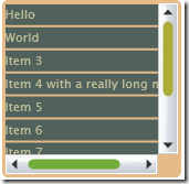
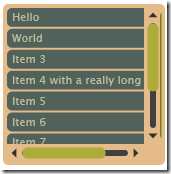
Here's what it looks like:
The bar alongside the vertical scrollbar is actually a very stretched horizontal scrollbar. For some reason, while it successfully uncollapses the VerticalRootElement, it does not collapse the HorizontalRootElement when you create a vertical scrollbar. After much frustration I discovered that this is a known bug in the current Silverlight beta.
So finally we have completely customised scrollbars for our ListBox. Please excuse my hideous choice of colours. I am not a designer! I hope to add one further post to add the remaining two features to make our ListBox complete:
- Selected Item Rendering
- Mouse Over Rendering
 A place for me to share what I'm learning: Azure, .NET, Docker, audio, microservices, and more...
Comments
Great tutorial, it helped me make a beautiful listbox. I did figure out why the horizontal element was not being collapsed for vertical scrollbars, but was for horizontal... You need to set Visibility="Collapsed" for both the HorizontalRootElement and VerticalRootElement Grids in the style. Then everything works great.
ValerieHrm... seems as soon as I posted I realized that makes the horizontal scroll bar disappear (but not the vertical).
ValerieThe only way I was able to get the horizontal scrollbar artifact to go away was to copy the entire ScrollBarStyle1 and rename the copied style, then in one of them set the HorizontalRootElement's Visibility="Collapsed" (leaving the VerticalRootElement visible) and in the other style do the opposite. Then I tell the scrollbars in the ScrollViewerStyle which style they should use, accordingly.
ValerieI tried to "clean up" the styles by removing some unnecessary stuff (but leaving both the horizontal and vertical parts in both styles, just emptying out the parts that weren't being used), and it was throwing nasty Null pointer errors.
Do you have any insight on how to remove some of the redundancy in the styles, to get around this bug and not have so much duplication?
Hi Valerie,
Mark Hthe scrollbar bug is annoying, but it is claimed that it will be fixed in the next beta of Silverlight, so I am just hanging on for the moment. I'm hoping we'll see another beta in the next month or so
Hi Mark,
Nuno SantosGreat tutorial.
One question. The vertical scroolbar bug. Do you have any workaround for it while the next beta is not available?
Thx,
Nuno
hi nuno, the workaround would be to create two identical styles - one for the vertical scrollbar, and one for the horizontal scrollbar. Then in the vertical scrollbar template, simply remove any visible elements from the (unused) horizontal scrollbar's template.
Mark HThanks!
Pankaj K SIt has given me a breakthrough I was looking for to get my list box a custom scroll bar.
Thanks again!
Nice Article.
Hi Valeris, can i use in Siverlight4?
spam-devthank you.
How to make the vertical scrollbar shorter than the content.
AnonymousI tried using Margin="0,15,0,15" for the "VerticalRoot" Grid. By the side-effect is he thumb actually pushes and scrolls the bottom arrow ??
Hello,
AnonymousHow to make the vertical scrollbar shorter than the content?
I tried using Margin="0,15,0,15" for the "VerticalRoot" Grid. But, the side-effect is that the thumb actually pushes and scrolls the bottom arrow ??
-- Al
[email protected]