Styling a ListBox With Silverlight 2 Beta 2 (Part 2) - Scrollbars
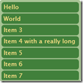
In my first post, I explained how to create a very basic ListBox and ListBoxItem style that governed the appearance of a ListBox. It is still very rudimentary though, and doesn't give any visual feedback of selected items or mouse over. It also doesn't have any scrollbars. Here's what we have so far (with a few changes to the colours - although I'm not sure it's an improvement!):
Adding scrollbars is actually quite simple. All we need to do is add a ScrollViewer to our ListBox style.
<Border Padding="3" Background="#E6BB8A" CornerRadius="5">
   <ScrollViewer x:Name="ScrollViewer"
       Padding="{TemplateBinding Padding}">
       <ItemsPresenter />
   </ScrollViewer>
</Border>
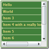
Which gives us scrollbars:
Unfortunately, as nice as the default scrollbars look, they do not fit at all with the visual theme of our ListBox. We need another style which we will base on the default ScrollViewer style.
Here's the ScrollViewer template, slightly customised to remove the border and the square in the bottom right-hand corner. It looks a little intimidating because I left in most of the stuff from the default ScrollViewer style. We could have got rid of a lot of it, but as we are not planning to customise this part very much, we will leave it in there.
<Style TargetType="ScrollViewer" x:Key="ScrollViewerStyle1">
   <Setter Property="IsEnabled" Value="true" />
   <Setter Property="Foreground" Value="#FF000000" />
   <Setter Property="BorderBrush" Value="#FFA4A4A4" />
   <Setter Property="BorderThickness" Value="1" />
   <Setter Property="HorizontalContentAlignment" Value="Left" />
   <Setter Property="VerticalContentAlignment" Value="Top" />
   <Setter Property="Cursor" Value="Arrow" />
   <Setter Property="TextAlignment" Value="Left" />
   <Setter Property="TextWrapping" Value="NoWrap" />
   <!-- Cannot currently parse FontFamily type in XAML so it's being set in code -->
   <!-- <Setter Property="FontFamily" Value="Trebuchet MS" /> -->
   <Setter Property="FontSize" Value="11" />
   <Setter Property="VerticalScrollBarVisibility" Value="Visible" />
   <Setter Property="Template">
       <Setter.Value>
           <ControlTemplate TargetType="ScrollViewer">
               <Grid Background="{TemplateBinding Background}">
                   <Grid.ColumnDefinitions>
                       <ColumnDefinition Width="*"/>
                       <ColumnDefinition Width="Auto"/>
                   </Grid.ColumnDefinitions>
                   <Grid.RowDefinitions>
                       <RowDefinition Height="*"/>
                       <RowDefinition Height="Auto"/>
                   </Grid.RowDefinitions>
                   <!-- Fill="{DynamicResource {x:Static SystemColors.ControlBrushKey}}" -->
                   <ScrollContentPresenter
                     x:Name="ScrollContentPresenter"
                     Grid.Column="0"
                     Grid.Row="0"
                     Content="{TemplateBinding Content}"
                     ContentTemplate="{TemplateBinding ContentTemplate}"
                     Cursor="{TemplateBinding Cursor}"
                     Background="{TemplateBinding Background}"
                     HorizontalContentAlignment="{TemplateBinding HorizontalContentAlignment}"
                     TextAlignment="{TemplateBinding TextAlignment}"
                     TextDecorations="{TemplateBinding TextDecorations}"
                     TextWrapping="{TemplateBinding TextWrapping}"
                     VerticalContentAlignment="{TemplateBinding VerticalContentAlignment}"
                     Margin="{TemplateBinding Padding}" />
                   <ScrollBar
                     x:Name="VerticalScrollBar"
                     Grid.Column="1"
                     Grid.Row="0"
                     Orientation="Vertical"
                     Cursor="Arrow"
                     Visibility="{TemplateBinding ComputedVerticalScrollBarVisibility}"
                     ViewportSize="{TemplateBinding ViewportHeight}"
                     Minimum="0"
                     Maximum="{TemplateBinding ScrollableHeight}"
                     Value="{TemplateBinding VerticalOffset}"
                     Width="18"/>
                   <ScrollBar
                     x:Name="HorizontalScrollBar"
                     Grid.Column="0"
                     Grid.Row="1"
                     Orientation="Horizontal"
                     Cursor="Arrow"
                     Visibility="{TemplateBinding ComputedHorizontalScrollBarVisibility}"
                     ViewportSize="{TemplateBinding ViewportWidth}"
                     Minimum="0"
                     Maximum="{TemplateBinding ScrollableWidth}"
                     Value="{TemplateBinding HorizontalOffset}"
                     Height="18"/>
               </Grid>
           </ControlTemplate>
       </Setter.Value>
   </Setter>
</Style>
So now we need to tell our ScrollViewer to use this style.
<ScrollViewer x:Name="ScrollViewerElement"
   Style="{StaticResource ScrollViewerStyle1}"
   Padding="{TemplateBinding Padding}">
   <ItemsPresenter />
</ScrollViewer>
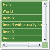
And this is what it looks like:
Kind of disappointing, huh? That's because we haven't styled the scrollbars themselves yet. Now we need to take a look at the default scrollbar style. Now these really are intimidating. They contain hundreds of lines of XAML with plenty of VisualStates, Storyboards and gradients. Even more confusingly they contain templates within templates.
We will progress by looking at each of these sub-templates one by one. First up is HorizontalIncrementTemplate, which is the right-arrow at the end of the horizontal scrollbar. Here's a simplified version of the default implementation:
<ControlTemplate x:Key="HorizontalIncrementTemplate" TargetType="RepeatButton">
   <Grid x:Name="Root" Background="#00000000">
       <vsm:VisualStateManager.VisualStateGroups>
           <vsm:VisualStateGroup x:Name="CommonStates">
               <vsm:VisualStateGroup.Transitions>
                   <vsm:VisualTransition To="MouseOver" Duration="0:0:0.2" />
               </vsm:VisualStateGroup.Transitions>
               <vsm:VisualState x:Name="Normal" />
               <vsm:VisualState x:Name="MouseOver">
                   <Storyboard>
                       <ColorAnimation Storyboard.TargetName="ButtonColor" Storyboard.TargetProperty="Color" To="#FF557E9A" Duration="0" />
                   </Storyboard>
               </vsm:VisualState>
               <vsm:VisualState x:Name="Disabled">
                   <Storyboard>
                       <DoubleAnimation Storyboard.TargetName="ButtonVisual" Storyboard.TargetProperty="Opacity" To=".6" Duration="0" />
                   </Storyboard>
               </vsm:VisualState>
           </vsm:VisualStateGroup>
       </vsm:VisualStateManager.VisualStateGroups>
       <Grid.ColumnDefinitions>
           <ColumnDefinition Width="35*"/>
           <ColumnDefinition Width="30*"/>
           <ColumnDefinition Width="35*"/>
       </Grid.ColumnDefinitions>
       <Grid.RowDefinitions>
           <RowDefinition Height="25*"/>
           <RowDefinition Height="50*"/>
           <RowDefinition Height="25*"/>
       </Grid.RowDefinitions>
       <Path x:Name="ButtonVisual" Grid.Column="1" Grid.Row="1" Stretch="Fill" Data="F1 M 511.047,352.682L 511.047,342.252L 517.145,347.467L 511.047,352.682 Z ">
           <Path.Fill>
               <SolidColorBrush x:Name="ButtonColor" Color="#FF313131" />
           </Path.Fill>
       </Path>
   </Grid>
</ControlTemplate>
Although this looks like a lot of code, all that is happening is simply a triangle is being drawn. The grid simply serves to give an appropriate margin around the triangle. The animations change the colour for mouse-over. I have removed the focus rectangle as I don't need it for my purposes. The actual background to the arrow is drawn by another part of the template. So for now I will leave these as they are and to move onto the "Thumb" components.
I have simplified the thumb component to be a rounded rectangle that changes colour as you hover over it. I also played with the margins to make it a little thinner. Here is my modified VerticalThumbTemplate:
<ControlTemplate x:Key="VerticalThumbTemplate" TargetType="Thumb">
   <Grid>
       <vsm:VisualStateManager.VisualStateGroups>
           <vsm:VisualStateGroup x:Name="CommonStates">
               <vsm:VisualStateGroup.Transitions>
                   <vsm:VisualTransition To="MouseOver" Duration="0:0:0.1" />
               </vsm:VisualStateGroup.Transitions>
               <vsm:VisualState x:Name="Normal" />
               <vsm:VisualState x:Name="MouseOver">
                   <Storyboard>
                       <ColorAnimation Storyboard.TargetName="ThumbForeground"
                                       Storyboard.TargetProperty="Color"
                                       To="{StaticResource ThumbHoverColor}" Duration="0" />
                   </Storyboard>
               </vsm:VisualState>
               <vsm:VisualState x:Name="Disabled">
                   <Storyboard>
                       <DoubleAnimation Storyboard.TargetName="ThumbVisual"
                                        Storyboard.TargetProperty="Opacity"
                                        To=".6" Duration="0" />
                   </Storyboard>
               </vsm:VisualState>
           </vsm:VisualStateGroup>
       </vsm:VisualStateManager.VisualStateGroups>

       <Grid x:Name="ThumbVisual">
           <Rectangle x:Name="Background"
               Margin="4.5,.5,4.5,.5"
               RadiusX="5" RadiusY="5" >
               <Rectangle.Fill>
                   <SolidColorBrush x:Name="ThumbForeground"
                   Color="{StaticResource ThumbForegroundColor}" />
                </Rectangle.Fill>
           </Rectangle>
       </Grid>
   </Grid>
</ControlTemplate>
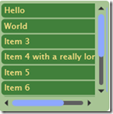
With a similar change to the HorizontalThumbTemplate, our scrollbars are now finally beginning to change in appearance (n.b. To see the changes we have also had to modify our ScrollViewer style so that the two scrollbars it creates use the new ScrollBar style). Here's a screenshot showing the mouse hovering over the vertical thumb:
Finally we are ready to update the remaining parts of the ScrollBar template - HorizontalRoot and VerticalRoot. Both are made up of a grid containing four repeat buttons and a thumb. Two of the repeat buttons are for the increment icons, while the other two are the invisible parts either side of the thumb that you can click for a large change.
Again, the change is simply to get rid of a load of unnecessary stuff. In our case we are simply putting a thin rounded rectangle behind the thumb and invisible repeat buttons, with no background behind the small increment buttons. Here's the new HorizontalRoot template:
<!-- Horizontal Template -->
<Grid x:Name="HorizontalRoot">
   <Grid.ColumnDefinitions>
       <ColumnDefinition Width="Auto" />
       <ColumnDefinition Width="Auto" />
       <ColumnDefinition Width="Auto" />
       <ColumnDefinition Width="*" />
       <ColumnDefinition Width="Auto" />
   </Grid.ColumnDefinitions>

   <Grid.RowDefinitions>
       <RowDefinition />
       <RowDefinition />
   </Grid.RowDefinitions>

   <!-- Track Layer -->
   <Rectangle Margin="1,6,1,6"
     Grid.RowSpan="2" Grid.Column="1"
     Grid.ColumnSpan="3" Fill="#FF606060"
     RadiusX="3" RadiusY="3" />

   <!-- Repeat Buttons + Thumb -->
   <RepeatButton x:Name="HorizontalSmallDecrease" Grid.Column="0" Grid.RowSpan="2" Width="16" IsTabStop="False" Interval="50" Template="{StaticResource HorizontalDecrementTemplate}" />
   <RepeatButton x:Name="HorizontalLargeDecrease" Grid.Column="1" Grid.RowSpan="2" Width="0" Template="{StaticResource RepeatButtonTemplate}" Interval="50" IsTabStop="False" />
   <Thumb x:Name="HorizontalThumb" MinWidth="10" Width="20" Grid.Column="2" Grid.RowSpan="2" Template="{StaticResource HorizontalThumbTemplate}" />
   <RepeatButton x:Name="HorizontalLargeIncrease" Grid.Column="3" Grid.RowSpan="2" Template="{StaticResource RepeatButtonTemplate}" Interval="50" IsTabStop="False" />
   <RepeatButton x:Name="HorizontalSmallIncrease" Grid.Column="4" Grid.RowSpan="2" Width="16" IsTabStop="False" Interval="50" Template="{StaticResource HorizontalIncrementTemplate}" />
</Grid>
We make a similar change for the VerticalRoot and here's what it looks like:
The bar alongside the vertical scrollbar is actually a very stretched horizontal scrollbar. For some reason, while it successfully uncollapses the VerticalRoot, it does not collapse the HorizontalRoot when you create a vertical scrollbar. After much frustration I discovered that this is a known bug in the current Silverlight beta and sadly it has not been fixed in Beta 2.
So finally we have completely customised scrollbars for our ListBox. Please excuse my hideous choice of colours. I am not a designer! I hope to add one further post to add the remaining two features to make our ListBox complete:
- Selected Item Rendering
- Mouse Over Rendering
Continue to Part 3...
 A place for me to share what I'm learning: Azure, .NET, Docker, audio, microservices, and more...


Comments
Thank you for these tutorials. I really appreciate it! I am looking forward to your next post!
Richard BinningtonRichard
This is a great resource. Is the 3rd article ready yet? Great job and THANK YOU!
AnonymousSorry for the delay. I have been a little busy recently, and changes to the VisualStateManager meant that the third part needed more rework than I expected. I've finished updating the code now, so the post should be able to follow some time this coming week.
Mark Hthanks a lot for your post.i'm a begenner, i tried some parts and i appreciate them. But for the last one, i meet a problem. Could you tell me where i have to put the HorizontalIncrementTemplate?
Anonymousthanks in advance and sorry for my bad english
if you look at Part 3 in this series, you can download a sample project and see where to put all the pieces
Mark HMark,
IndyYour articles are perhaps the only resource for people trying to skin the ScrollViewer! Really, it is very nice of you to take the time and share with the rest of the world your knowledge.
I have a question about the three parts you have written. Is it possible to layout the listbox such that the width of the listbox equals (or, it is a bit more than) the width the widest Listboxitem? I am working on skinning the listbox in WPF and fighting an issue where the width of the listbox varies with the width of the listboxitems as I scroll down, after the first scroll, the listbox width is fixed. I have a post in the WPF MSDN Forums at the moment - http://forums.msdn.microsoft.com/en-US/wpf/thread/9ac9da13-cb53-47cd-acbe-226b8a8064ba/
Cheers,
indyfromoz
Hi indyfromoz,
Mark HIts not something I have tried. I am sure that there is a way you could do this. It might be worth asking around on the silverlight forums for ideas.
I'm a little bit confused about this part "(n.b. To see the changes we have also had to modify our ScrollViewer style so that the two scrollbars it creates use the new ScrollBar style)". How we modify the scrollviewer style with the style of the scrollbar???
AnonymousWhere in your template do you "remove" the little square that appears when two scrollbars meet. I have my own customization, but I cannot figure out what to set to get that little box to dissapear.
AnonymousThanks