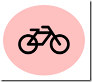
How to Create Circular Backgrounds for your Font Awesome Icons
I was recently using the font awesome icons for a webpage I was creating, which provide a really nice scalable set of general purpose icons, and I wanted them to appear on a circular background, something like this:
But not being an expert in CSS, I didn’t know how to set this up. After a bit of searching and experimentation I found two different ways to create this effect.
Method 1: CSS circles
The first is to create the circle using the border-radius css property and some padding to create space around your icon. You can set the radius to 50% or to half the width and height to create a circle. The only catch is that the container needs to be square, otherwise you’ll end up with an ellipse. For example, if I use this style
.circle-icon {
    background: #ffc0c0;
    padding:30px;
    border-radius: 50%;
}
And then try to use it with a font awesome icon like this:
<i class="fa fa-bicycle fa-5x circle-icon"/>
I get an ellipse:
So we need to specify the height and width explicitly, and this leads us to also need some rules to get our icon centred horizontally (using text-align) and vertically (using line-height and vertical-align). So if we update our CSS style like this:
.circle-icon {
    background: #ffc0c0;
    width: 100px;
    height: 100px;
    border-radius: 50%;
    text-align: center;
    line-height: 100px;
    vertical-align: middle;
    padding: 30px;
}
Now we get the circle as desired:
So mission accomplished, sort of, although it feels a shame to have to specify exact sizing for things. Maybe any CSS experts reading this can tell me a better way of accomplishing this effect. The good news is that font awesome itself has a concept of “stacked” icons which offers another way to achieve the same effect.
Method 2 – Stacked Icons
Stacked icons are basically drawing two font awesome icons on top of each other. Font awesome comes with the fa-circle icon which is a solid circle, so we can use that for the background. We need to style it to set the background colour correctly, and we use fa-stack-2x on this icon to indicate that it must be drawn twice the size of the icon that will appear to be inside the circle. Then we put both icons inside a span with the fa-stack class, and we can still use the regular font awesome styles to choose the overall icon size, such as fa-4x. So here for example, I have
<span class="fa-stack fa-4x">
  <i class="fa fa-circle fa-stack-2x icon-background"></i>
  <i class="fa fa-lock fa-stack-1x"></i>
</span>
where icon-background is simply specifying a background colour:
.icon-background {
    color: #c0ffc0;
}
and this looks like this:
As you can see this is a nice simple technique, and I prefer it to the CSS approach. Font awesome also includes circles with borders, so if you want to create something like this (I used three stacked icons), you can:
To experiment with this yourself, try this jsfiddle.
 A place for me to share what I'm learning: Azure, .NET, Docker, audio, microservices, and more...


Comments
Very nice post.This has helped me with Font Awesome CSS icon styling. Thanks and best wishes :-)
Richard DickinsonA great find. Thanks for this.The stack option is far easier to implement than the CSS. Thanks again.
Phil MooreGreat post thanks a lot!
Charlie Whitea newbie here. i understand the stacked icons. But how to create the icon background colours? ( as per the jsfiddle examples) Do I have to create a new class and add this to the fontawesome ccs file?
Bingo Little (tradingfootball)it can be in any css file. usually you'd have your own one in addition to fontawesome
Mark HeathBut that does not seem to work for some icons such as facebook or googleplus
spaquetThis helped me a lot! Thank you!
Jenny RosenbergerAwesome!! You just saved me hours of trying to get that ellipse circular!
Lexx YungCartervery good man!
Adam Ahmadhow i can only change the border color ?
Abu bakertry the jsfiddle. You can adjust the color of the outer circle with a class as is shown in one of the examples
Mark HeathThis post is awesome. Nice work.
BrookeThanks mate, saved me some time
ZakI think this is far better then css background.... thanks a lot man
MD: RejoanThank you.
ThaninratThis will also work as a hybrid of both
Garrick K Crouchi.far.fa-circle.fa-stack-2x {
border: 2px solid #000;
border-radius: 50%;
height: 64px;
width: 64px;
position: relative;
left: 8px;
color: transparent;
}
Thanks a lot for this impotent post.
Junaet Hossainthank you...!
anuchuri sravanthithanks so much, just what I was looking for.
Frank PigeonWorks great - love it - thanks for sharing this!
Amos Van Horn